


The Cricket Conversation Effect: How Brands Become Part of Everyday Culture
It’s 8:47pm on a Sunday in April. IPL match, 15th over. India needs 47 off 30 balls. Every WhatsApp group in the country is on fire. Two hundred million people watching the same three minutes of cricket. In that moment, three brands are being mentioned in almost every conversation. Dream11. CRED. MPL. Again, not because they bought ads during the over, but because their names have somehow become part of how people talk about cricket, watch cricket, and process cricket. The brand has stopped being a sponsor and started being part of the fabric of the conversation itself. Most Indian brands using cricket for marketing miss this completely. Sponsoring cricket is easy. Any brand with a big enough budget can put its logo on a jersey. What’s hard is getting your brand inside the conversation about cricket. The brand that runs an ad during the match, and the brand that becomes something people mention while watching the match, are doing two different things. Almost every Indian brand is aiming at the first. The second is where the value lives. Let’s break down what happens when a brand becomes part of the cricket conversation. Dream11: Turning Every Viewer into a Stakeholder It sold fantasy cricket by turning every viewer into a stakeholder in the match. Once you have a team in play, you’re not watching the match. And every time you do this, Dream11 becomes a reference point in the room without needing an ad slot. MPL: Owning the Language of the Match It moved into the language of the match. Dropped catches became MPL moments. Big shots became MPL moments. The brand injected itself into how commentators and casual viewers described what was happening. It became a way of speaking about the sport. The Common Thread Cricket is one of the very few categories in India where casual brand mentions in the middle of a conversation still feel natural. You can say the word CRED at a family dinner during the match and nobody blinks. You can bring up Dream11 in office chai without it feeling like an advertisement. This is extraordinary in a country where every other category of casual brand mention has been colonised by influencer marketing to the point that audiences are suspicious of any brand reference at all. “Cricket is the last safe conversational space for brand names in India.”And most brands are wasting it by trying to sponsor their way in when the play is to speak their way in. How to Speak Your Way In Match the Emotional Beats of the Game Zomato and Swiggy have started doing this well. Their tweets during matches read the room. They react to what just happened on the field with jokes anyone watching the match immediately understands. The brand feels like another person in the WhatsApp group, not a company running an ad campaign. Borrow the Sport’s Vocabulary When a brand adapts its language to how the sport is actually talked about, viewers subconsciously absorb the brand as part of the sport’s ecosystem. This is what MPL did brilliantly for a while. The vocabulary trick is worth an entire ad budget when it works. Create Moments Fans Repeat CRED’s ads work because Rahul Dravid losing his cool in a traffic jam became a shared cultural reference. The ad stopped being an ad and became a piece of content people quoted at each other for months. Own the Second Screen Most Indians watch cricket with their phone in hand. Twitter feed, WhatsApp group, Instagram stories. Brands that show up in the second screen with content that reads the match build recall that lasts long after the match ends. A Word of Caution Every year, a handful of brands try to force their way into the cricket conversation and fail badly. The rule is simple. If the brand’s presence doesn’t feel like something a cricket fan would organically say, it won’t land. Cricket audiences have a finely calibrated sense of who belongs and who is buying their way in. Cricket is the highest-leverage marketing opportunity in India for brands willing to do the cultural work. It’s also the highest-risk one for brands who think they can shortcut it with a sponsorship cheque. Cricket Is Year-Round. Your Strategy Should Be Too. That’s 200 days of the most engaged audience the country has, phone in hand, ready to absorb the brands that feel like they belong. Show up like a fan. Talk like a fan. Earn your place. The rest is math. 🏏
Why We Buy Things at Airports We Would Never Buy at a Regular Mall
It’s 4am at Bengaluru airport. Your flight is in 90 minutes. You’ve checked in. You’ve cleared security. You’re wandering duty-free, and you find yourself buying a 3,200-rupee bottle of Baileys you have never considered buying at a regular liquor store. Fifteen minutes later, you’re eyeing a Toblerone the size of a small child, which you will not eat, and which costs eight hundred rupees more than at a Nature’s Basket in Koramangala. Near the exit, you buy a novel you will not read on the flight. By the time you board, you’ve spent about 6,000 rupees on things you did not need, from categories you would not normally shop in, at prices you would normally reject. Every airport in the world runs on this exact behaviour. It is not a coincidence. It is a specific, engineered psychological state that airports and airlines have perfected over decades. And once you understand it, you also start understanding a specific type of customer psychology that most Indian D2C brands could learn a huge amount from. Here’s the opinion most brands don’t want to hear. Airport buying behaviour is not a special case. It is a preview of what happens when you remove the specific mental defences customers normally deploy against advertising. And if you can recreate any small piece of that state in your regular retail experience, you can produce airport-level willingness to spend from otherwise price-sensitive customers. Let’s break down what’s actually happening in the airport, psychologically. 👇 1. Decision Fatigue The first thing is decision fatigue. By the time you reach duty-free, you’ve made 40 small decisions in two hours. The prefrontal cortex is exhausted. Its ability to say no is temporarily impaired. This is the same psychological state as choosing a takeaway at 11pm after a 14-hour workday. Or buying the extended warranty at the phone counter after picking a phone for an hour. Or accepting the 25% off cross-sell during a wedding shopping session. Airports engineer decision fatigue deliberately. 2. The Window of Unaccountability The second thing is the window of unaccountability. The customer is between two social contexts. They’ve left home. They haven’t arrived at the destination. Nobody’s watching what they buy in this 90-minute liminal window. The purchase feels invisible to the household budget, invisible to the partner, invisible to the money-conscious version of themselves. So the purchase happens, and it gets rationalised as a travel expense later. 3. Anchoring The third thing is anchoring. Airport prices are visibly higher than street prices. Normally this should scare customers away. It does the opposite. The higher prices reset the internal reference point. An 800-rupee Toblerone at Nature’s Basket looks expensive. An 800-rupee Toblerone at duty-free, where the Toblerone next to it is 1,200 and the imported chocolate spread is 2,400, looks like a bargain. The brain re-anchors to the airport pricing environment. Now think about what this means for regular retail. The brands that outperform their competitors have often figured out how to create small pockets of the airport state inside their normal retail experience. Not by manipulating customers. By reducing the cognitive load, the accountability, and the reference-point resistance around the purchase. The Zomato at 11pm feels like a small airport moment. The customer is decision-fatigued. There is nobody watching. The internal reference is not “how much would this cost at the restaurant” but “how much does not eating cost me right now.” The purchase happens. What can Indian brands actually do with this insight? 1. First, know when your customer is in an airport-like state, and design for that specific moment. Late-night, in-transit, post-work exhaustion, weekend indulgence windows. These are your highest-conversion opportunities. Design specifically for them. 2. Second, reduce reference-point resistance at the point of sale. Show what similar products cost in the same environment, not what your product costs versus street prices. Anchoring inside your environment beats anchoring against the outside world. 3. Third, respect the permission window. If your customer is in a moment of self-indulgence, don’t shove functional messaging in front of them. Meet them in the emotional state they’re already in. We tell our D2C clients that airports have engineered the highest-conversion consumer environment on earth, and there’s a lot to learn from them without being manipulative. The customer spends more when friction is reduced, nobody is watching, and the reference point is set by the brand. Every Indian D2C brand can create small pockets of this. Almost none do. You will never buy anything at an airport that you needed. Which is exactly why airports keep making so much money.
The Psychology of Micro-Commitments in Online Buying
Every founder asks themselves the same question about their checkout flow. Why are so many people getting to the buy button and then disappearing? The cart is full. The intent is clear. At the final moment, something breaks. The customer hesitates and leaves. 🛒 The answer lies in one of the most reliable findings in behavioural psychology, and it’s a concept most marketing teams have heard of but underuse. Micro-commitments. 🧠 How Micro-Commitments Work Humans are far more likely to take a big step if they’ve already taken several small ones in the same direction. The principle was first documented in the 1960s, when researchers showed that households who agreed to put a small sign in their window supporting a campaign were much more likely, weeks later, to agree to a much larger sign on their lawn. The small commitment changed how the person saw themselves. They had become “the kind of person who supports this campaign.” The larger ask felt consistent with that identity. By the time a customer is asked to spend 1,800 rupees on a moisturiser, they’ve already made about seven smaller commitments. Each of these is a tiny yes that makes the next yes easier. The brands losing the most sales at checkout are usually the ones asking the customer to make the entire commitment at once, with no smaller commitments built into the path. The customer arrives via an ad, lands on a product page, sees the price, and has to decide right there whether to commit. That’s a big ask. Most people defer it. Most people don’t come back. Brands that win at conversion build a series of small invitations into the customer journey, each of which feels low-risk on its own, and which collectively walk the customer toward the larger commitment without it ever feeling like a leap. What does this actually look like? It starts with the first interaction. Inside the website, the same logic applies. There’s psychology behind why this works. Once a customer has made a small commitment, their brain treats the next request as consistent with who they’ve already shown themselves to be. They followed the brand, they read the content, they took the quiz, they added to cart. They’ve already become the kind of person who buys from this brand. The purchase stops feeling like a decision and starts feeling like a continuation of who they already are. 🧠 The opposite is also true. Customers who haven’t been walked through small yeses treat the purchase as a much bigger decision than it actually is. The brain finds the comparison unfavourable and defers. The brand never gets the customer back. Practical Ways to Apply This There are a few practical ways to apply this for any online business. 1. Map out the customer journey from first impression to purchase. Count the number of yeses required between awareness and conversion. If the answer is fewer than five, the journey is asking for too much commitment too fast. Add lower-stakes invitations earlier. Each one is a small yes that increases the probability of a later, larger yes. 2. Restructure the checkout to break the ask into smaller steps. Collect the email first. The shipping address second. Payment third. Each step on its own page. Conversion rates routinely improve when this is done well, because each step feels small even when the cumulative effort is the same. 3. Use commitment-style microcopy. The language on the button matters as much as what it does. At Mirra Digital, we’ve increasingly built funnel structures around micro-commitment frameworks, with direct ad-to-product page paths reserved only for very specific use cases. The early-stage assets get more clients in the door. The conversion improves at every subsequent step. The math compounds. Big decisions are made up of small ones. The brands that respect this build sales journeys customers walk through willingly. The brands that ignore it keep wondering why the cart abandonment rate is so high. 🛒
Why People Remember Stories but Forget Marketing Claims
Quick experiment. Can you remember the last marketing claim a brand made that genuinely stuck with you? The exact words, the exact promise, the exact stat. Probably nothing comes to mind, even though you’ve been exposed to thousands of marketing claims in the last month. Now think about the last story a friend told you that you can still recall in some detail. The trip that went wrong. The wedding that went sideways. The small thing your colleague said that made everyone laugh in the meeting. The memories arrive vividly, almost without trying. This is one of the oldest patterns in human cognition, and one of the most consistently ignored in marketing. Humans remember stories. Humans forget claims. The brands that figure this out build durable awareness. The brands that don’t keep producing marketing copy that nobody can recall five minutes after they’ve read it. Why does this happen? The answer is structural. The brain processes stories and claims completely differently. A claim is a statement that requires the listener to evaluate, judge, and decide whether to believe. “Our product is the most effective on the market.” The brain hears the claim, runs it through a quick credibility check, and usually flags it as unreliable because almost every brand makes a similar claim. The neurons fire briefly and the information gets discarded. The brain has been trained over decades of advertising to treat marketing claims as low-priority data. A story bypasses the credibility filter entirely. “My customer used to wake up at 3am every night worrying about her business. After three months on our platform, she sleeps through the night.” The brain doesn’t evaluate this the way it evaluates a claim. It processes it as narrative. Narrative gets stored differently, in regions of the brain associated with autobiographical memory and emotional context. Stories enter as experiences. The brain stores them in a way that bypasses the fact-verification machinery entirely. Neuroscientists have mapped this in detail. When a person hears a story, multiple brain regions activate simultaneously, including motor cortex, sensory cortex, and emotional processing areas. The brain effectively simulates the experience being described. A well-told story produces a physical reaction. A well-constructed argument produces, at most, intellectual agreement. The implications for marketing are significant. Most brand messaging is structured as claims. “Trusted by 10,000 customers.” “Best-in-class support.” “Industry-leading performance.” The phrases are technically true and completely forgettable. They activate the credibility filter, get discounted, and disappear from memory within seconds. Brands that lead with stories enter the customer’s mind through a completely different door. The reader doesn’t have to evaluate the truth of a generic claim. They watch a small story unfold and remember the brand by association with that story for years. What does story-led marketing actually look like in practice? It looks like specificity. The skincare brand that says “Priya’s combination skin felt tight every morning. After eight weeks, the tightness was gone” is doing more work than the brand saying “effective for combination skin.” The first sentence has a name, a sensation, a timeline, a transformation. It enters the reader’s memory as a small narrative. The second sentence is a claim that gets immediately filtered out. It looks like customer-led content. The case study with real names, real numbers, and real problems significantly outperforms the testimonial that says “great product, highly recommend.” The former is a story. The latter is a claim wearing the costume of one. It looks like founder narrative. “We started this brand because the existing options frustrated me as a customer. Here’s the specific thing that went wrong, the specific decision I made about it, and what happened next.” The founder story builds brand memory in a way that no value proposition ever could. Audiences across India, the Middle East, and Australia have different cultural expectations for stories. Indian audiences respond to longer, more emotionally textured ones. Middle Eastern audiences respond to family and legacy narratives. Australian audiences respond to understated, slightly self-deprecating ones. The format varies. The underlying psychology stays the same. What can a brand actually do with this? Audit the current marketing copy for the ratio of claims to stories. Most brands are running 90% claims and 10% stories. The story content tends to live in case studies that nobody reads, while the claim content sits on the homepage where everyone sees it. Flipping this is one of the most impactful changes a brand can make. Collect customer stories systematically. Real stories, with detail, arc, and specificity. Generic testimonials don’t count. Get on a call with five customers a quarter and ask them to walk you through what was happening in their life or business before they found the brand, what made them try it, and what happened after. Record the conversation. Their actual sentences are the marketing copy the brand needs. At Mirra Digital, the campaigns we build around customer stories and founder narratives outperform the campaigns built around product claims, often by significant margins. The story has always been the better delivery system for what a brand wants to say. Claims wash out of the brain by the time the page closes. A good story persists for years. Choose accordingly.
Why “I Don’t Know” Is the Hardest Sentence to Write Online
Try a small experiment. 👇 Open LinkedIn, Twitter, or Instagram right now and search for the phrase “I don’t know.” Then count how many posts you actually find from real people in real conversations, not from think-pieces written about the phrase. It’s almost none. Across the internet, in the spaces where people are supposedly being their authentic selves, three small words have become almost extinct. “I don’t know” has been replaced by : Everyone seems to know everything. Nobody seems to be allowed to be uncertain in public anymore. There’s actual psychology behind why this happens, and it’s worth understanding, because the phenomenon affects : How people make decisions, How brands position themselves, and How trust actually gets built online in 2026. Start with the simple part. Humans are wired to seek certainty. The brain spends an enormous amount of energy trying to reduce ambiguity, because in evolutionary terms, ambiguity was dangerous. Knowing whether the rustle in the grass was a tiger or the wind was a survival skill. The brain that produced confident answers, even slightly wrong ones, generally lived longer than the brain that paused to wonder. Modern humans inherited this wiring. We feel safer when we have an opinion than when we have a question. Now add the layer that social media adds. Online, every statement carries a small social bet. The algorithm rewards confidence even when the confidence is misplaced. The reward system trains everyone to perform certainty whether they have it or not. Then add the workplace pressure. Most professional environments treat uncertainty as weakness. Saying “I don’t know” in a meeting often feels like admitting incompetence, even when honest uncertainty is the most accurate position to hold. All of this compounds. By the time a person sits down to write a LinkedIn post or a tweet or a blog, the muscle for saying “I don’t know” has atrophied. The default mode is to: Even when the person doesn’t actually have one. The consequences of this play out in interesting ways for consumer behaviour. Audiences in 2026 are getting weirdly tired of confidence. There’s so much manufactured certainty in the feed that any signal of genuine uncertainty stands out as refreshing. Examples: Honesty about uncertainty is becoming a competitive advantage, and most brands haven’t noticed. Audiences are also getting better at spotting fake certainty. The over-confident LinkedIn post about a topic the author clearly doesn’t deeply understand reads as performative now. Readers can sense when a person is dressing up a guess as a conviction. The performance hurts trust more than it builds it. There’s a useful question for any brand or founder making content. Could I write this same post and end it with: “and honestly, I’m still figuring this out?“ If the answer is yes, the post is probably more truthful than the polished version. If the answer is no, the post might be the kind of confident-sounding content that’s flooding the feed and contributing to the problem. This applies to consumer-facing brands too. Customers buy with more confidence from brands that admit: The brand that says: “this won’t work if your concern is X“ sells better than the one claiming to be for everyone. The financial product that says: “this is a long-term play, you’ll see returns over three years, not three months“ earns more deposits than the one promising instant results. People can feel when a brand is being honest about its limitations. The takeaway The hardest sentence to write online is the one that admits to not knowing. The internet has made it almost embarrassing to be uncertain. The funny thing is that uncertainty is the most relatable emotion most readers actually feel, most of the time. The people who give themselves permission to write it are the ones who end up sounding the most human in a feed full of false experts. So here’s a small challenge. Next time you sit down to post something, try ending with: “I don’t know yet, but I’m thinking about it.“ See what happens. It’s harder than it sounds. 💙 And more powerful than most people realise.
Why People Buy at 11pm
Around 11pm, a particular phenomenon plays out across millions of phones. A person who has spent the day responsibly saying no to things is now in bed, on their second scroll of Instagram, and is about to buy a 1,800-rupee scented candle they have no actual use for. By 11:14pm, the candle has been ordered. By 11:15pm, the same person is half-asleep, wondering why they did that. This is the late-night purchase, and it happens to almost everyone. The data suggests it isn’t a small phenomenon. A significant chunk of e-commerce sales happen between 10pm and midnight, with conversion rates that consistently outperform other parts of the day. There’s actual psychology behind why this window is so commercially powerful, and most brands are barely paying attention to it. Decision Fatigue: The Brain Is Tired Start with what’s happening to the human at 11pm. By night, the brain is running on whatever’s left, which is usually not much. This is decision fatigue at its most pronounced. The ability to weigh, evaluate, and resist is degraded. The brain defaults to the easiest option, and clicking buy is often the easiest option. The Emotional Environment Changes Everything The candle at 11pm isn’t being purchased for its candle-ness. It’s being purchased because it promises a better version of tomorrow, and at 11pm that promise is genuinely persuasive. Less Comparison, Faster Decisions Add to this the fact that the comparison instinct is weaker at night. During the day, a shopper might open four tabs, compare prices, read reviews, check delivery times, and abandon the cart twice. At 11pm, the same shopper sees a product on Instagram, clicks the link, taps buy, and confirms with a thumbprint. The entire transaction is over before any analytical part of the brain gets a word in. The Algorithm Knows There’s also the algorithm. Social platforms have figured out, with depressing precision, that late-night audiences are emotionally available in a way daytime audiences aren’t. The whole feed turns into something gentler, more atmospheric, and significantly better at converting. The system gives late-night users more of what they respond to. Meet The 11pm Shopper All of this combines into a very particular kind of shopper. The late-night purchase has a specific texture to it. Rarely a necessity. Almost always an aspiration. The new yoga mat, the unnecessary skincare upgrade, the air fryer that’s going to change everything. These are 11:32pm purchases, made with one eye open, with the kind of confidence that only shows up after midnight. Why Brands Should Pay Attention What’s interesting is how few brands design for this window. Most ad campaigns run during “business hours,” because that’s when the dashboards look most active. Meanwhile, the most commercially fertile window of the day is happening on phones in dark bedrooms, and the brands paying attention to it are outperforming everyone else without making any noise about it. There are a few things worth considering for any brand selling online. 1. Look at the conversion data by hour. Most brands have never actually segmented it. The 10pm to midnight slot often reveals patterns nobody noticed. 2. Match the tone to the time. Late-night audiences respond to softer, more atmospheric, more lifestyle-driven content. The high-energy product-demo video that works at 11am falls flat at 11pm. The dim-lit, slow-paced reel performs the opposite way. 3. Don’t punish the late-night buyer. The most common 11pm regret has more to do with the brand making it hard to return things than the purchase itself. Generous return policies turn impulse buyers into repeat customers. The opposite kind turns them into one-star reviewers writing furious posts at 9am the next morning. The 11pm shopper is a real category. The brands that figure this out understand something most marketing strategies miss. Conversion is partly about logic, timing, and channel. The other part is being the right brand on the right person’s phone at the exact moment their willpower decides to clock out for the night.
Price Anchoring in the Age of Instant Comparison
There’s a popular theory in e-commerce circles that price anchoring stopped working the moment customers got smartphones. Anchoring used to work because shoppers couldn’t easily compare prices, so the first number they saw became their reference point. Now they can open three tabs in thirty seconds and check Amazon, Flipkart, and the brand’s own site before paying. The anchor, the theory says, has been broken by transparency. It’s a tidy theory. It’s also wrong. Anchoring is one of the most stubborn quirks in human decision-making, and it’s been studied to death by behavioural economists since the 1970s. People judge value relatively. The first number they see becomes a reference point against which every other number gets measured, often unconsciously. Even when shoppers know the anchor is arbitrary, even when they actively check other prices, the anchor still shapes how they perceive value. The comparison tab open in the background changes how the anchor functions, without removing it. Walk through what actually happens when a customer browses a product on a brand’s website. With the anchor, it felt cheap. The Amazon tab didn’t break the spell. It reinforced it. This is why the strike-through price hasn’t disappeared from e-commerce. The two get blended together, and the blended version still favours the seller. The Decoy Effect: Anchoring’s Smarter Cousin Then there’s the more sophisticated cousin of anchoring, which is the decoy effect. A brand offers three pricing tiers. This is anchoring used architecturally. The customer feels like they made a smart, considered decision. The brand engineered the decision before the customer arrived. Both of these tactics survive in the age of instant comparison because comparison doesn’t override psychology. The extra price points the customer sees become more data filtered through the same psychological lens. Indian E-commerce and Anchoring Indian e-commerce has been leaning on anchoring aggressively, in ways that are sometimes useful and sometimes deeply suspect. The MRP-vs-discount theatre that dominates fashion and FMCG, where every product is listed at 70% off a price nobody ever paid, is anchoring at its most cynical. Customers are getting wise to this. When everything is 70% off forever, the 70% stops feeling like a deal and starts feeling like a lie. The anchor still works, but the trust around it erodes. Smarter Ways to Use Anchoring There are smarter ways to use anchoring without sliding into MRP fakery. 1. Premium Product Anchoring Pair products at different price points so the brand can lead with the higher-priced one and let the lower one feel accessible by comparison. A premium hero product on a homepage works as the anchor for the rest of the catalogue, making everything else feel reasonable. Many luxury brands operate this way deliberately, with a single hero product priced absurdly high to anchor the rest of the line. 2. Bundle Pricing Bundle pricing also leans on anchoring. A three-pack at a slight discount to three individual purchases makes the single purchase look expensive by comparison, which can shift the customer up to the bundle without feeling pressured. 3. Subscription Pricing Subscription pricing uses anchoring constantly. The monthly price is shown alongside the annual price, with the annual presented as the better deal because the per-month math works out lower. Anchoring has survived every prediction of its death. It’s a psychological principle that holds up even when the customer has every other price at their fingertips. The real question is how it gets used. Cynical anchoring builds short-term conversion and long-term distrust. Thoughtful anchoring helps customers make decisions they’re happy with, at prices the brand can sustainably charge.
The Endowment Effect in E-Commerce: Why Free Trials Still Outperform Discounts
Most e-commerce brands chasing growth reach for the same lever first. It works in the short term, the dashboard lights up, and then the brand spends the next six months wondering why none of those discount-acquired customers came back at full price. There’s an older, slightly stranger lever that consistently outperforms discounts on lifetime value, and most Indian brands aren’t using it. The free trial. The reason free trials work has a name in behavioural economics. A discount asks the customer to make a decision. The customer is still being asked to spend money, and money decisions involve : A free trial flips the entire dynamic. That’s a very different psychological calculation, and it heavily favours the brand. This is why streaming services, software companies, and subscription boxes have leaned on free trials for years. They understood early that E-commerce has been slower to catch on, partly because physical products are harder to give away than digital ones. The discount looks cheaper because the loss is visible and contained. The free trial looks risky because the cost is upfront. So most brands stick with the discount, even though the math on lifetime value usually favours the other approach. ⇥ Here’s what’s actually happening when a brand runs a steady discount strategy. A year of discount-led promotions and the brand has effectively repriced itself in the customer’s mind, without ever changing the MRP. Free trials work differently. The customer experiences the product first. If the product is genuinely good, the endowment effect kicks in. The full price stays full. The brand stays positioned as premium. Indian e-commerce has been experimenting with this slowly. Each of these is using the endowment effect, whether the brand knows the term or not. ⇥ There are a few practical things worth saying about deploying free trials well. The product has to be genuinely good. The trial length should match how the product works. The window has to be calibrated to the product. Long enough for the customer to genuinely integrate it, and not so long that the urgency to decide disappears. Brands also need to think about whether they’re ready ethically. The endowment effect, like most behavioural economics, is a psychological principle that can be used to help customers or to trap them. There’s a difference between: The former is good marketing. The latter is the kind of dark pattern that makes regulators write new laws and customers leave one-star reviews.
The Decision Fatigue Factor: Why Too Many Choices Kill Your Conversion Rate
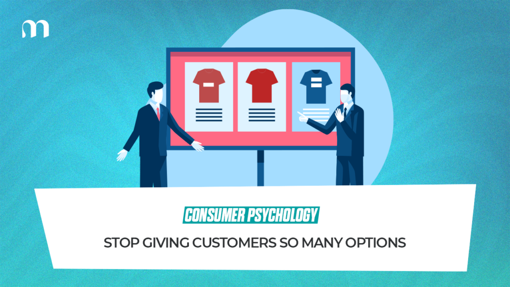
There’s a counter-intuitive truth at the heart of most underperforming e-commerce stores. The brand believes it’s adding value by offering more options. The customer experiences those same options as a slow form of suffering. Choice is supposed to be a good thing. On paper, every additional option increases the chance that something will be right for the customer. In practice, every additional option also increases the chance the customer leaves without buying anything at all. The phenomenon has a name. Decision fatigue. The science on this is settled and not especially flattering to how most brands design their stores. Human attention is finite. Decision-making is metabolically expensive. Each small choice the brain processes uses energy, and after a certain number of decisions, the brain starts defaulting to the easiest possible option. The easiest possible option, for an overwhelmed shopper, is usually to close the tab. The classic study on this involved jam. Researchers set up a tasting booth in a supermarket with either 24 varieties or 6 varieties. Foot traffic and conversion measure different things, and most e-commerce stores are designing for foot traffic while expecting conversion. Look at how a typical product page actually works. A customer lands on a moisturiser product page. The brand has built what it considers a comprehensive product page. The customer has been asked to make eleven decisions before they can buy something they came in already wanting. Most will hesitate, lose momentum, and drift away. Now look at how the best-converting product pages tend to be designed. The decision the customer has to make is reduced to its essential form. Do they want this product, yes or no. Everything else is removed, deferred, or hidden until after the core decision is made. This is harder than it sounds, because brands have a deep instinct to add. Every internal stakeholder wants their feature on the product page. The packaging team wants size variants visible. The sustainability team wants the eco-certification badge prominent. The marketing team wants the Each addition feels small. Together they ask the customer to make more decisions than they signed up for. The same logic applies to A brand that sells 200 SKUs across 12 categories will outsell one that sells 600 SKUs across 40 categories, assuming the product itself is comparable, because the smaller catalogue is easier to navigate and harder to abandon out of overwhelm. Indian e-commerce has a particular issue with this, because the cultural instinct to over-give is strong. Brands want to show every possible variant, demonstrate range and depth, prove that the catalogue is comprehensive. Abundance has been confused with helpfulness, and customers can tell the difference. Here’s what actually helps. Default the obvious choice and let the customer override it if they want. Group products into clear use cases instead of expecting the customer to figure it out from scratch. Replace the “all products” landing page with a “best for you” entry point that narrows the field before the customer has to think. A well-curated e-commerce store feels like talking to a knowledgeable shop assistant who knows what to recommend, keeps the relevant options in front of the customer, and handles everything else in the background. That kind of experience converts dramatically better than a sprawling catalogue, because it reduces options at exactly the moments the customer most needs reduction. Decision fatigue is invisible until a brand actively looks for it. Once it’s noticed, it’s hard to unsee. If the number is higher than five, the page is leaking conversions, and no amount of additional UX polish or ad spend will fix what fewer choices would have prevented in the first place. More options feel like generosity. They are mostly friction wearing a friendlier name.
The Psychology of Waiting: Why Your Checkout Flow Is Losing You Money
Every e-commerce brand spends most of its energy getting people into the cart. Layers of work designed to convince a stranger to add something to their basket. Then the customer hits checkout, the page takes four seconds to load, and they vanish. Checkout is where most brands lose the customers they spent hundreds of rupees acquiring, and the reasons are almost always psychological more than technical. ⇥ The most studied effect at play is loss aversion. People feel the pain of losing something roughly twice as strongly as they feel the pleasure of gaining something equivalent. In checkout, this matters more than it sounds. Once a customer has added a product to their cart, they’ve mentally taken ownership of it. The checkout process is now a series of small frictions standing between them and the thing they already feel they have. Frustration builds. The customer abandons. The product was wanted, the checkout was the problem, and the friction got expensive in psychological terms before the purchase did in financial ones. This is why a three-second delay at checkout can cost more conversions than a 10% price increase. The price is a known cost. The delay is an unknown cost, and unknown costs feel worse because the brain can’t bound them. ⇥ Waiting itself is a strange psychological problem. Research on waiting times suggests that the perception of waiting matters more than the actual duration. Brands obsessed with reducing actual seconds often miss the bigger win, which is reducing the perception of how long checkout takes. This is why the best checkout flows show progress indicators, name each step clearly, and use micro-animations to acknowledge what’s happening. Then there’s the friction from forms. Every additional field a customer fills out increases drop-off, and the increase is not linear. Going from three fields to six doesn’t double the drop-off, it can quadruple it. Each new field forces a small decision, each decision invites the brain to question whether the purchase is worth it. Brands that ask for The trick is to ask only for what’s needed to complete the order, and ask for everything else later, after the purchase is locked in. ⇥ There’s also the psychology of surprise costs, which is genuinely one of the worst checkout sins. A customer reaches the final page and discovers that The total is higher than what they thought they were paying. This surprise functions as a loss, and loss aversion does its thing. The customer abandons at near-double the rate of customers who saw all costs upfront on the product page. The amount is rarely the actual problem. The surprise is. Transparency upfront, even when it shows a slightly higher total, converts better than transparency at the end with the same final number. People will pay more for things they expected to pay more for. They walk away from things that grew during checkout. ⇥ There’s a final piece worth naming, which is the psychology of choice overload at checkout. The customer is now making four decisions when they wanted to make one. Each decision delays them, each delay invites doubt, and doubt at checkout is fatal. Let the customer get to “done” with as few clicks as the law and the product allow. The brands winning at checkout focus on something most teams don’t measure. How the customer feels during checkout, which is a different problem from raw speed. Make every second feel intentional and every screen feel deliberate. That’s the difference between a checkout flow that converts and one that bleeds customers at the last possible moment.