

 Back to Blogs
The Psychology of Waiting: Why Your Checkout Flow Is Losing You Money
Every e-commerce brand spends most of its energy getting people into the cart.
- The ads,
- the homepage,
- the product pages,
- the reviews,
- the urgency banners.
Layers of work designed to convince a stranger to add something to their basket.
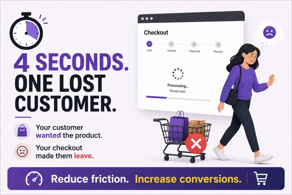
Then the customer hits checkout, the page takes four seconds to load, and they vanish.
Checkout is where most brands lose the customers they spent hundreds of rupees acquiring, and the reasons are almost always psychological more than technical.
⇥ The most studied effect at play is loss aversion.
People feel the pain of losing something roughly twice as strongly as they feel the pleasure of gaining something equivalent.
In checkout, this matters more than it sounds.
Once a customer has added a product to their cart, they’ve mentally taken ownership of it.
The checkout process is now a series of small frictions standing between them and the thing they already feel they have.
- Every extra step,
- every slow page,
- every form field,
- every popup, registers as a small threat to that ownership.
Frustration builds. The customer abandons.
The product was wanted, the checkout was the problem, and the friction got expensive in psychological terms before the purchase did in financial ones.
This is why a three-second delay at checkout can cost more conversions than a 10% price increase.
The price is a known cost.
The delay is an unknown cost, and unknown costs feel worse because the brain can’t bound them.
⇥ Waiting itself is a strange psychological problem.
Research on waiting times suggests that the perception of waiting matters more than the actual duration.
- A loading screen with no progress indicator feels longer than a slightly slower one with a clear progress bar.
- A four-step checkout that tells the customer where they are feels faster than a two-step checkout that leaves them wondering.
Brands obsessed with reducing actual seconds often miss the bigger win, which is reducing the perception of how long checkout takes.
This is why the best checkout flows show progress indicators, name each step clearly, and use micro-animations to acknowledge what’s happening.
- The customer knows they’re moving forward.
- They feel less stuck.
- They stay engaged through the friction because the friction feels finite.
Then there’s the friction from forms. Every additional field a customer fills out increases drop-off, and the increase is not linear.
Going from three fields to six doesn’t double the drop-off, it can quadruple it.
Each new field forces a small decision, each decision invites the brain to question whether the purchase is worth it. Brands that ask for
- date of birth,
- gender,
- marketing preferences, and
- a referral source …on the same page as payment details are creating five separate opportunities for the customer to walk away.
The trick is to ask only for what’s needed to complete the order, and ask for everything else later, after the purchase is locked in.
⇥ There’s also the psychology of surprise costs, which is genuinely one of the worst checkout sins.
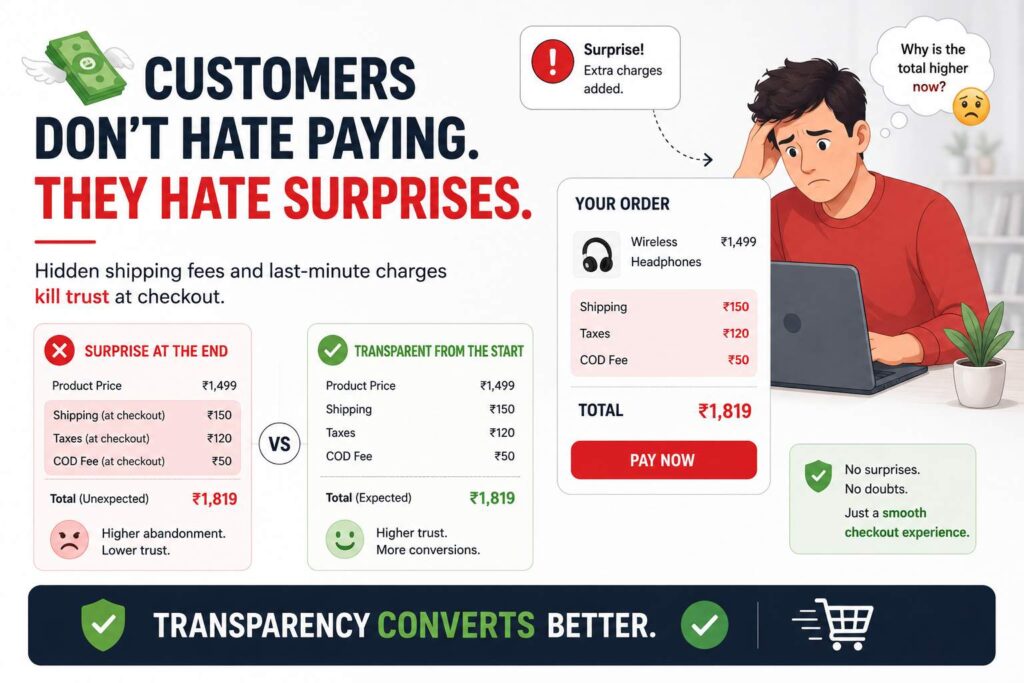
A customer reaches the final page and discovers that
- shipping is 150 rupees,
- taxes are added separately, and
- the COD fee is another 50.
The total is higher than what they thought they were paying.
This surprise functions as a loss, and loss aversion does its thing.
The customer abandons at near-double the rate of customers who saw all costs upfront on the product page.
The amount is rarely the actual problem. The surprise is.
Transparency upfront, even when it shows a slightly higher total, converts better than transparency at the end with the same final number. People will pay more for things they expected to pay more for. They walk away from things that grew during checkout.
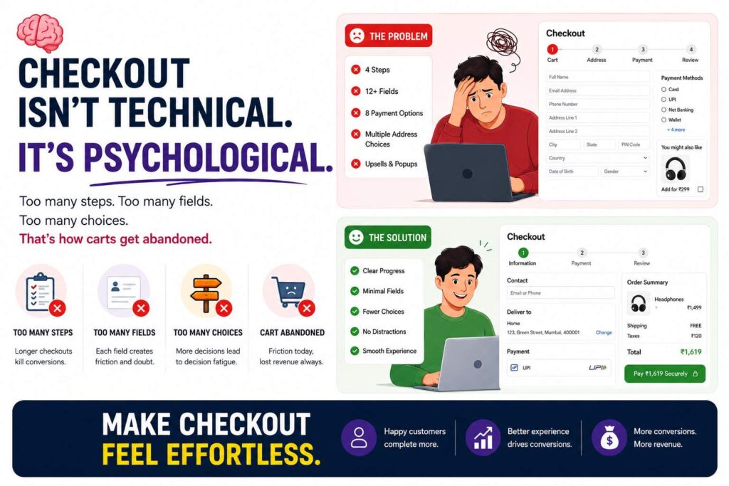
⇥ There’s a final piece worth naming, which is the psychology of choice overload at checkout.
- Some brands offer 12 payment options,
- three address suggestions,
- two delivery preferences, and
- an upsell.
The customer is now making four decisions when they wanted to make one.
Each decision delays them, each delay invites doubt, and doubt at checkout is fatal.
- Streamlining choice is genuinely an act of customer service.
- Default the obvious choice.
- Show only the options that matter at that step.
Let the customer get to “done” with as few clicks as the law and the product allow.
The brands winning at checkout focus on something most teams don’t measure.
How the customer feels during checkout, which is a different problem from raw speed.
- Reduce surprise.
- Show progress.
- Cut unnecessary fields.
- Hide complexity until after the purchase is complete.
Make every second feel intentional and every screen feel deliberate. That’s the difference between a checkout flow that converts and one that bleeds customers at the last possible moment.